Northern Xscape UX Design.
soft ware
Adobe XD, Adobe Illustrator
Project Overview
Northern Xscape Rentals is a rental company located in Haliburton, Ontario, and they provide Jet ski and snowmobile as rental services. It has an hour and a half day of price plan options, and the rental fee includes a temporary boaters license and safety equipment for customers’ activity. More, they have a minimum + $1000 deposit, and free cancellations within 72 hours before using the service and rental website.
Problem
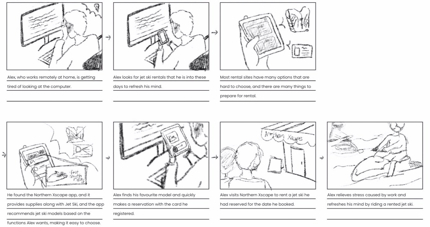
It takes a lot of procedures and supplies to rent jet skiing and snowmobile, making it difficult for people to do as a hobby. Moreover, there are not many places to rent it, and there are many options for models, but the price varies widely, so people hesitate to choose what to choose. People do not want to spend much of their spare time preparing to ride a jet ski, and they even do not have an app for rent.
Solution
The company creates apps to make them more accessible and more available to users, prepares materials so that users do not waste time, and recommends models to meet customer requirements through the recommending system to help customer’s concerns. In addition, app intent entering necessary information when people sign in so that users do not go through many processes when using the app all the time.
Competitive Analysis
User persona
Storyboard
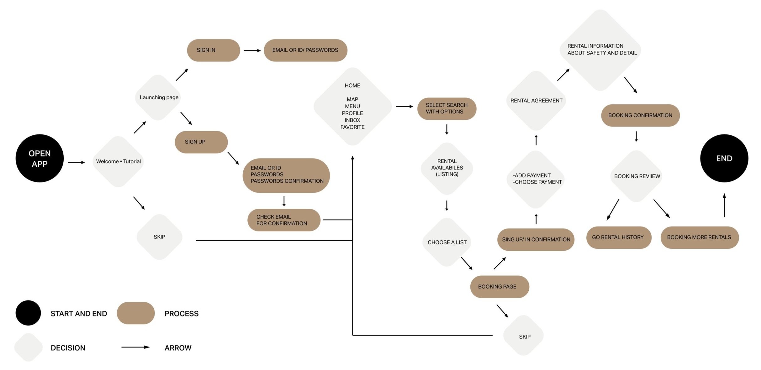
User Flow Diagram
Brand Guide
Purple and green are the primary colours. Purple uses a green colour that indicates that customers can feel belonging by giving customers royalties. The Norton Xscape app is a leisure app that indicates peacefulness, so I utilize green. In addition, as much as using a mobile phone application(or any other monitor), both colours have been decided to reduce fatigue in users’ eyes.
● Colour palette
#7C7CFC
#AFAFFF
124 124 252
#F7F6FF
174 175 255
241 238 255
#205F2D
RGB colour*
#689F75
32 94 45
104 159 117
Typography uses the Sanserif type Poppins Fonts, which is a neutral, safe, and round curve, allowing users to understand well, no under 11pt for readability, and the body text used between 11-19pt. In addition, the font weight of Poppins fonts was used differently for sectional distinction as semi-bold, Italian, medium, and light.
● Typography
I made a simple and easy-to-remember logo with a straightforward Abstract logo, making it simple and not complicated when entering a smartphone. The logo with a primary colour represents the jet ski and the person, and the round line represents the appearance of the jet ski entering the water by giving gradation as water.
● Logo
Logo concept
Colour logo
Black logo
White logo
Wireframe Sketches
Low-Fidelity Wireframes
High-Fidelity Wireframes


